Context
The Transcendental Meditation movement began in the early 1950s and has since been taught to more than 10 million people across over 100 countries, with the aim of demystifying meditation and validating its benefits through modern science. Non-profit foundations such as the David Lynch Foundation have helped bring the TM technique to the general public, as well as to governments, businesses, and schools.
During my time contracting on the Transcendental Meditation app, the global organization underwent a comprehensive rebrand of its services and products with the London-based agency Made Thought. While the agency led the brand strategy and identity work, our in-house product team took ownership of the redesign and delivery of the new global website, tm.org.
Business Goal
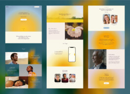
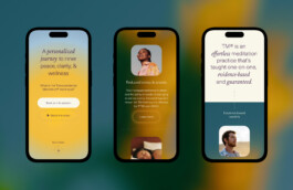
The goal of the website redesign was to translate the refreshed brand identity into a brand-led digital experience that clearly communicated the TM offering, built trust, and helped new users feel confident signing up.
The product team led the experience, defining the site structure, user flows, and interface patterns, ensuring that the new identity was applied with consistency and clarity. UI components were carefully crafted to balance elegance with usability, resulting in a cohesive website experience that reinforced credibility while improving engagement and overall user confidence.
User Problems & UXR insights
The project began with user research and an audit of the existing website to identify barriers to clarity, trust, and conversion.
— User research revealed that prospective students struggled to understand the differences between meditation types and felt uncertain about which practice was right for them. Many had previously tried mainstream meditation apps but were unable to maintain a consistent practice. Trust also emerged as a key issue: existing social proof relied heavily on celebrity endorsements, which felt inauthentic and failed to reassure skeptical users. This lack of trust was reinforced by broader negative perceptions and misinformation surrounding Transcendental Meditation, leading to confusion and hesitation before committing.
— Insights from the previous website highlighted important behavioral patterns. Most visitors accessed the site on mobile, and 95% of paid traffic was directed to local TM center pages, making them critical touchpoints in the user journey. Additionally, high-traffic landing pages focused on themes such as ADHD and anxiety, indicating that users were primarily motivated by the tangible benefits of the practice rather than the meditation methodology itself.
Some quotes from the user testing
"I tried Headspace but wasn't able to stick with it"
"I'd tried meditation during my yoga classes and honestly it was an enormous fail"
"The interaction with the TM.org is very formal. It feels very scripted"

Design process & approach
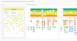
The team began by running a series of alignment workshops with key stakeholders, including the CEO and executive team, to define opportunities and collaboratively shape the end-to-end UX journey.
Based on research insights and alignment with paid ad traffic, we designed a mobile-first experience focused on clarity and conversion. An initial homepage iteration was used to test the narrative structure and calls to action supporting different booking paths.
Two primary user journeys were developed: one guiding new users toward booking a free introductory call, and another allowing more confident or existing leads to book the course directly, bypassing the introduction. In parallel, a dedicated journey for local TM center pages was designed, supported by new content templates, a refined sitemap, and a simplified navigation system.
The go to Market took a several months with different testing both
qualitative for the first prototype and then after building the flows we roll-out the website for specific Regions in the US and specific TM centers pages.


UI & Branding application
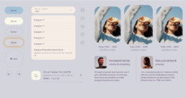
The design process involved careful consideration of modular variants and UI blocks, which were crafted to be versatile and easily repurposed for different types of content. This approach ensured scalability and flexibility, allowing for seamless integration of diverse content across the website.
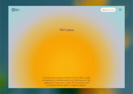
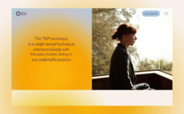
Furthermore, by alternating between backgrounds gradients, images, and flat colors, we aimed to create visual variety and stimulate user interest. This strategic use of different visual elements not only adds aesthetic appeal but also enhances the overall user experience by capturing attention and guiding users through the content journey.


Constraints & tradeoffs
Several constraints shaped the project, most notably team capacity and collaboration across regions. The work was led by a small, newly formed international team collaborating closely with a U.S.-based national team, which introduced coordination and communication challenges throughout the process.
To manage these constraints, the team prioritized launching a focused MVP rather than a fully realized experience. This allowed the core journeys to go live sooner, with a clear plan to iterate post-launch.
Following release, the team continuously optimized key flows and page content based on performance and feedback.
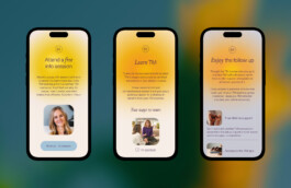
One notable iteration was the introduction of a new “Find a Teacher” flow, designed to feel more personal and teacher-led. This shift toward a more human, localized experience resulted in a noticeable increase in lead generation, validating the MVP-first, iterative approach.

A custom UI kit and a new Design System have been created in alignment with the new Branding.

Outcomes & Impact
The website launch was successful, driving a 28% increase in sales and lead generation and a 36.8% increase in engagement, alongside a 79% reduction in bounce rate.
Beyond performance metrics, the new website delivered a clearer and more engaging experience, while successfully translating the refreshed brand into a digital product context. This helped strengthen brand awareness and increased user confidence when booking a TM course.
Next steps include rolling out the design system across international sites and additional languages, and further optimizing key flows to improve conversion rates.
Context
The Transcendental Meditation movement began in the early 1950s and has since been taught to more than 10 million people across over 100 countries, with the aim of demystifying meditation and validating its benefits through modern science. Non-profit foundations such as the David Lynch Foundation have helped bring the TM technique to the general public, as well as to governments, businesses, and schools.
During my time contracting on the Transcendental Meditation app, the global organization underwent a comprehensive rebrand of its services and products with the London-based agency Made Thought. While the agency led the brand strategy and identity work, our in-house product team took ownership of the redesign and delivery of the new global website, tm.org.
Business Goal
The goal of the website redesign was to translate the refreshed brand identity into a brand-led digital experience that clearly communicated the TM offering, built trust, and helped new users feel confident signing up.
The product team led the experience, defining the site structure, user flows, and interface patterns, ensuring that the new identity was applied with consistency and clarity. UI components were carefully crafted to balance elegance with usability, resulting in a cohesive website experience that reinforced credibility while improving engagement and overall user confidence.
User Problems & UXR insights
The project began with user research and an audit of the existing website to identify barriers to clarity, trust, and conversion.
— User research revealed that prospective students struggled to understand the differences between meditation types and felt uncertain about which practice was right for them. Many had previously tried mainstream meditation apps but were unable to maintain a consistent practice. Trust also emerged as a key issue: existing social proof relied heavily on celebrity endorsements, which felt inauthentic and failed to reassure skeptical users. This lack of trust was reinforced by broader negative perceptions and misinformation surrounding Transcendental Meditation, leading to confusion and hesitation before committing.
— Insights from the previous website highlighted important behavioral patterns. Most visitors accessed the site on mobile, and 95% of paid traffic was directed to local TM center pages, making them critical touchpoints in the user journey. Additionally, high-traffic landing pages focused on themes such as ADHD and anxiety, indicating that users were primarily motivated by the tangible benefits of the practice rather than the meditation methodology itself.
Some quotes from the user testing
"I tried Headspace but wasn't able to stick with it"
"I'd tried meditation during my yoga classes and honestly it was an enormous fail"
"The interaction with the TM.org is very formal. It feels very scripted"

Design process & approach
The team began by running a series of alignment workshops with key stakeholders, including the CEO and executive team, to define opportunities and collaboratively shape the end-to-end UX journey.
Based on research insights and alignment with paid ad traffic, we designed a mobile-first experience focused on clarity and conversion. An initial homepage iteration was used to test the narrative structure and calls to action supporting different booking paths.
Two primary user journeys were developed: one guiding new users toward booking a free introductory call, and another allowing more confident or existing leads to book the course directly, bypassing the introduction. In parallel, a dedicated journey for local TM center pages was designed, supported by new content templates, a refined sitemap, and a simplified navigation system.
The go to Market took a several months with different testing both
qualitative for the first prototype and then after building the flows we roll-out the website for specific Regions in the US and specific TM centers pages.


UI & Branding application
The design process involved careful consideration of modular variants and UI blocks, which were crafted to be versatile and easily repurposed for different types of content. This approach ensured scalability and flexibility, allowing for seamless integration of diverse content across the website.
Furthermore, by alternating between backgrounds gradients, images, and flat colors, we aimed to create visual variety and stimulate user interest. This strategic use of different visual elements not only adds aesthetic appeal but also enhances the overall user experience by capturing attention and guiding users through the content journey.


Constraints & tradeoffs
Several constraints shaped the project, most notably team capacity and collaboration across regions. The work was led by a small, newly formed international team collaborating closely with a U.S.-based national team, which introduced coordination and communication challenges throughout the process.
To manage these constraints, the team prioritized launching a focused MVP rather than a fully realized experience. This allowed the core journeys to go live sooner, with a clear plan to iterate post-launch.
Following release, the team continuously optimized key flows and page content based on performance and feedback.
One notable iteration was the introduction of a new “Find a Teacher” flow, designed to feel more personal and teacher-led. This shift toward a more human, localized experience resulted in a noticeable increase in lead generation, validating the MVP-first, iterative approach.

A custom UI kit and a new Design System have been created in alignment with the new Branding.

Outcomes & Impact
The website launch was successful, driving a 28% increase in sales and lead generation and a 36.8% increase in engagement, alongside a 79% reduction in bounce rate.
Beyond performance metrics, the new website delivered a clearer and more engaging experience, while successfully translating the refreshed brand into a digital product context. This helped strengthen brand awareness and increased user confidence when booking a TM course.
Next steps include rolling out the design system across international sites and additional languages, and further optimizing key flows to improve conversion rates.