Context
The Transcendental Meditation movement began in the early 1950s and has since been taught to more than 10 million people across over 100 countries, with the aim of demystifying meditation and validating its benefits through modern science. Non-profit foundations such as the David Lynch Foundation have helped bring the TM technique to the general public, as well as to governments, businesses, and schools.
In 2021, during the pandemic, the world faced not only Covid-19 but also a significant issue with people's mental health. In the midst of this, I had the opportunity to start working for the Transcendental Meditation app.
Over the course of a year, we redesigned core app tabs (Library and Events), introduced new features, and refined the UI and app branding, from early discovery through implementation, driving higher retention and stronger long-term user engagement.
Case Study: Library tab redesign
Business Requirements
Define a clear post-course experience that supports new meditators after completing the digital TM course, guiding them from onboarding into a consistent, self-sustained practice.
Design a six-month, sequential guided journey that helps new meditators deepen understanding and build long-term habits.
Explore and validate the concept of a “TM Journey” as a structured curriculum, with differentiated pathways based on user needs, progress, or level of experience.
Introduce in-app mechanisms that increase engagement and retention over time, while enabling the collection of meaningful data on content consumption, progression, and user understanding.
User Problems & UXR insights
As part of validating the business requirements for post-course retention, we conducted early research on the Library tab.
User feedback highlighted a lack of guided structure and visibility, making content difficult to discover, revisit, or track over time.
Users had little incentive to return, couldn’t bookmark or resume content, and valuable TM tips were buried, weakening ongoing engagement and habit-building.

Design process & approach
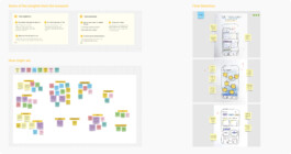
We began by running a series of alignment workshops with key stakeholders, including the CEO and executive team, to translate business requirements and the post-course curriculum into a shared product direction.
Based on this alignment, we designed an end-to-end flow prototype and iteratively tested it with users through qualitative interviews and usability sessions. Across multiple rounds of validation, user feedback directly informed structural and navigation decisions.

UXR Insights & Final Design
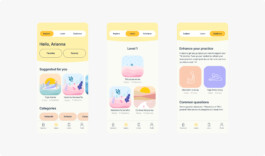
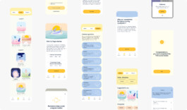
Introduced a second-level navigation informed by research, structured around three user needs:
— Explore: general content discovery
— Learn: structured post-course curriculum
— Guidance: practical TM tips for ongoing practice
Both tab naming and information architecture were validated through user testing and refined through executive reviews, resulting in a structure that balanced user clarity, pedagogical intent, and business goals.
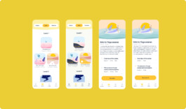
Within the Learn tab, we introduced the TM Journey as a level-based, sequential learning framework. Levels and sectioned progression provided clear milestones and a sense of advancement, applying a light-touch gamification approach, without rewards or locked content, to encourage motivation while preserving the integrity of the TM practice.

Positive reinforcements and progress tracking
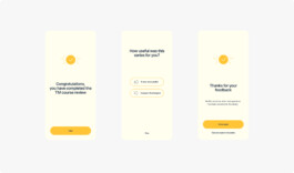
To encourage continued engagement, we introduced positive reinforcement screens after users completed a piece of content, celebrating their progress and prompting them to keep going. We also implemented progress tracking features, including visual progress bars and completion checkmarks, to provide a clear sense of achievement and momentum throughout the journey.

Progress tracking UI
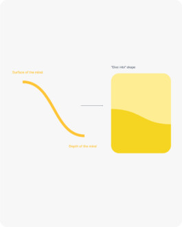
This is an example of my conceptual approach to visual design, where aesthetics are grounded in meaning. I designed a custom UI overlay element to indicate progress and completion, inspired by the ocean wave — a metaphor that resonates deeply with the experience of Transcendental Meditation. Just as a wave moves from the surface into the depths of the ocean, the design symbolizes the shift from surface-level consciousness to deeper states during meditation. It also represents the progressive deepening of knowledge as users complete more content and advance in their understanding.
We conducted user testing on this visual treatment and received overwhelmingly positive feedback. Users found the wave metaphor intuitive, calming, and closely aligned with their experience of TM, validating both its functional clarity and emotional resonance.

Iterating other app’s core features
Over several months, we continuously improved key features of the app based on user research and NPS feedback.
These iterative enhancements focused on increasing engagement, community connection, and habit formation:
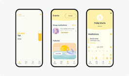
For the Timer, we introduced a real-time count of how many people were meditating simultaneously — a simple but powerful way to reinforce a sense of shared practice and community.
In the Events tab, we redesigned the group meditation list with a new UI, adding clear time labels, a live countdown to each session, and a featured section to highlight the most recent or relevant online event.
In the Profile section, we added a meditation streak tracker and a calendar view to help users visualize their consistency — turning meditation into a tangible habit and motivating regular practice.

Bridging Brand and Product Through Visual Language
In addition to the core product design work, I had the opportunity to shape both the illustration style and UI system of the app — ensuring a cohesive visual experience that bridges branding and product.
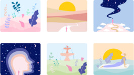
The illustration style reflects the soft, pastel color palette of the brand, while maintaining a vibrant and uplifting tone. Conceptually, the illustrations were designed to evoke a sense of journey, using metaphors aligned with the principles of Transcendental Meditation.
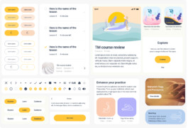
The UI system was crafted to feel warm, approachable, and human. To achieve this, I softened sharp edges and corners, creating an inviting visual language that balances personality with clarity. At every stage, we ensured the interface remained accessible and easy to navigate, without compromising on visual identity.

Some of the custom components designed for the UI Kit

Outcomes & Impact
Within the first month of launch, engagement with the Library feature increased by 22.6%, highlighting the effectiveness of the redesign in making content more accessible and engaging. The regularity of meditation also improved, rising from 57% to over 60%, as users responded positively to the added structure and motivational features.
Over a six-month period, user retention rose from 54% to 56%, while app stickiness remained strong at around 46%, indicating a high level of sustained user engagement.
Additionally, the refreshed branding, vibrant color palette, and custom illustrations received consistent praise from users, contributing to the app’s rating increase from 4.7 to 4.9, and reinforcing the impact of a cohesive and emotionally resonant design system.
Context
The Transcendental Meditation movement began in the early 1950s and has since been taught to more than 10 million people across over 100 countries, with the aim of demystifying meditation and validating its benefits through modern science. Non-profit foundations such as the David Lynch Foundation have helped bring the TM technique to the general public, as well as to governments, businesses, and schools.
In 2021, during the pandemic, the world faced not only Covid-19 but also a significant issue with people's mental health. In the midst of this, I had the opportunity to start working for the Transcendental Meditation app.
Over the course of a year, we redesigned core app tabs (Library and Events), introduced new features, and refined the UI and app branding, from early discovery through implementation, driving higher retention and stronger long-term user engagement.

Case Study: Library tab redesign
Business Requirements
Define a clear post-course experience that supports new meditators after completing the digital TM course, guiding them from onboarding into a consistent, self-sustained practice.
Design a six-month, sequential guided journey that helps new meditators deepen understanding and build long-term habits.
Explore and validate the concept of a “TM Journey” as a structured curriculum, with differentiated pathways based on user needs, progress, or level of experience.
Introduce in-app mechanisms that increase engagement and retention over time, while enabling the collection of meaningful data on content consumption, progression, and user understanding.
User Problems & UXR insights
As part of validating the business requirements for post-course retention, we conducted early research on the Library tab.
User feedback highlighted a lack of guided structure and visibility, making content difficult to discover, revisit, or track over time.
Users had little incentive to return, couldn’t bookmark or resume content, and valuable TM tips were buried, weakening ongoing engagement and habit-building.

Design process & approach
We began by running a series of alignment workshops with key stakeholders, including the CEO and executive team, to translate business requirements and the post-course curriculum into a shared product direction.
Based on this alignment, we designed an end-to-end flow prototype and iteratively tested it with users through qualitative interviews and usability sessions. Across multiple rounds of validation, user feedback directly informed structural and navigation decisions.

UXR Insights & Final Design
Introduced a second-level navigation informed by research, structured around three user needs:
— Explore: general content discovery
— Learn: structured post-course curriculum
— Guidance: practical TM tips for ongoing practice
Both tab naming and information architecture were validated through user testing and refined through executive reviews, resulting in a structure that balanced user clarity, pedagogical intent, and business goals.
Within the Learn tab, we introduced the TM Journey as a level-based, sequential learning framework. Levels and sectioned progression provided clear milestones and a sense of advancement, applying a light-touch gamification approach, without rewards or locked content, to encourage motivation while preserving the integrity of the TM practice.

Positive reinforcements and progress tracking
To encourage continued engagement, we introduced positive reinforcement screens after users completed a piece of content, celebrating their progress and prompting them to keep going. We also implemented progress tracking features, including visual progress bars and completion checkmarks, to provide a clear sense of achievement and momentum throughout the journey.

Progress tracking UI
This is an example of my conceptual approach to visual design, where aesthetics are grounded in meaning. I designed a custom UI overlay element to indicate progress and completion, inspired by the ocean wave — a metaphor that resonates deeply with the experience of Transcendental Meditation. Just as a wave moves from the surface into the depths of the ocean, the design symbolizes the shift from surface-level consciousness to deeper states during meditation. It also represents the progressive deepening of knowledge as users complete more content and advance in their understanding.
We conducted user testing on this visual treatment and received overwhelmingly positive feedback. Users found the wave metaphor intuitive, calming, and closely aligned with their experience of TM, validating both its functional clarity and emotional resonance.

Iterating other app’s core features
Over several months, we continuously improved key features of the app based on user research and NPS feedback.
These iterative enhancements focused on increasing engagement, community connection, and habit formation:
For the Timer, we introduced a real-time count of how many people were meditating simultaneously — a simple but powerful way to reinforce a sense of shared practice and community.
In the Events tab, we redesigned the group meditation list with a new UI, adding clear time labels, a live countdown to each session, and a featured section to highlight the most recent or relevant online event.
In the Profile section, we added a meditation streak tracker and a calendar view to help users visualize their consistency — turning meditation into a tangible habit and motivating regular practice.

Bridging Brand and Product Through Visual Language
In addition to the core product design work, I had the opportunity to shape both the illustration style and UI system of the app — ensuring a cohesive visual experience that bridges branding and product.
The illustration style reflects the soft, pastel color palette of the brand, while maintaining a vibrant and uplifting tone. Conceptually, the illustrations were designed to evoke a sense of journey, using metaphors aligned with the principles of Transcendental Meditation.
The UI system was crafted to feel warm, approachable, and human. To achieve this, I softened sharp edges and corners, creating an inviting visual language that balances personality with clarity. At every stage, we ensured the interface remained accessible and easy to navigate, without compromising on visual identity.

Some of the custom components designed for the UI Kit

Outcomes & Impact
Within the first month of launch, engagement with the Library feature increased by 22.6%, highlighting the effectiveness of the redesign in making content more accessible and engaging. The regularity of meditation also improved, rising from 57% to over 60%, as users responded positively to the added structure and motivational features.
Over a six-month period, user retention rose from 54% to 56%, while app stickiness remained strong at around 46%, indicating a high level of sustained user engagement.
Additionally, the refreshed branding, vibrant color palette, and custom illustrations received consistent praise from users, contributing to the app’s rating increase from 4.7 to 4.9, and reinforcing the impact of a cohesive and emotionally resonant design system.